Welcome to old and new friends who are interested in discussing Cajun and other diatonic accordions, along with some occasional lagniappe....
CAJUN ACCORDION DISCUSSION GROUP
Really ~
Should it have an accordion on it?
should it have a picture of one of the "GREATS"
on it?
This would be a great idea to help us identify
one another, in case we happen to be at the
same event and I would also love wearing a CAJUN shirt
I actually vote for "RICH" colors
Hi Eavygal, now that really depends on were you wear it ..... maybe consider an alligator, or a swarm of maringouins. You can get away with that everywhere, even in Dallas, especially when Rick's not around. - Nout
--- --- --- --- --- --- --- --- ---
Replying to:
Really ~
Should it have an accordion on it?
should it have a picture of one of the "GREATS"
on it?
This would be a great idea to help us identify
one another, in case we happen to be at the
same event and I would also love wearing a CAJUN shirt
I actually vote for "RICH" colors
If I get some down-time, I will seriously take a crack at it. I'm a graphic designer by trade, but my spare time is precious. I do have some ideas that are not run-of-the-mill shirt-with-an-accordion-on-it. If I can distill this notion into some clean vector artwork, it could be used for more applications than just a tee-shirt. It just takes some undisturbed time, which is usually earmarked for things like songwriting and rehearsing!
I guess the big question is; is Eva the only one who would want to purchase such a shirt? If there's a big interest generated for a such a shirt, then the need for a design becomes more urgent.... ya know?
R!CK
Looking forward to see your graphics efforts Rick!
Myself and a few others had fun inputting and helping coordinate the new logo and graphics on the Hohner Supreme and Xtreme line..and some aspects of the Compadre.. ( I coached a graphic artist ).. and we modified the retro lettering of the 60's Coronas..adding a few changes, added a " barb " design logo on the Xtreme ( resembling a tribal tattoo a little )..and revamped the grille on the Compadre to subliminally incorporate an H for Hohner.. ( they call it the spiderman grille..but it was really inspired from a Swatch watch design ).
Seems the liberty scroll on most cajun accordions seems to be a universally recognizable . . . the PineLeafboys sure do some nice merchandising artwork.. one of the cleverest representations of accordion bellows for advertising is on the BOLZANO safety razor ( see link above )..
happy pondering..
G
Rick is Right...
So lets see some interest ...Hey Hey!
and by the way we dont want a run of the mill shirt
maybe an alligator getting ready to take a chunk outa ya ~

And maybe change your forum name to Eavilaccordion? - nout
--- --- --- --- --- --- --- --- ---
Replying to:
Rick is Right...
So lets see some interest ...Hey Hey!
and by the way we dont want a run of the mill shirt
maybe an alligator getting ready to take a chunk outa ya ~
I think no matter what the main design looks like, in tribute to Joanie and her "very much recognized" CADG forum logo above, somehow, this logo should be represented somewhere on the shirt. Even if it's at the bottom on the backside or on the front left pocket area. That of course, if she owns the right to this logo and doesn't mind. Just my opinion.
Honestly, this is a great idea and i wonder why it wasn't thought of before. It will make it easy for all Braves to recognize and introduce themselves at different festivals/events.
WF
My suggestion would be to keep it simple, but flashy, like gold on pink or something, so we could spot each other in a large crowd, which will be its main function, right?
I know I'd contribute, maybe even get them done if I have the design in hand. I have a local shirt shop I do business with.
=Jamey
I'd buy one...heck I would probably buy one for each person in my family!
are ye' daft now?
--- --- --- --- --- --- --- --- ---
Replying to:
My suggestion would be to keep it simple, but flashy, like gold on pink or something, so we could spot each other in a large crowd, which will be its main function, right?
I know I'd contribute, maybe even get them done if I have the design in hand. I have a local shirt shop I do business with.
=Jamey
There should be a mitered corner in the T-shirts.
And maybe on the shoulders the same shape as the metal corner part, just like an accordion.
The color of that part could be pink, but that's not a must. (imo)
On the brest an image of the accordion from this forum.
Sweat pads for heavy duty gigs for under one's arm pits? Bullet proof kevlar if you play in a cajun unfriendly juke joint? nt
Seriously..I want to make the guys happy on this and us girls
can wear the masculine look much better than the guys will wear
a girlie look ! As a matter of fact on this one , I think I "prefer" the hard core look
Hey I am hearing some great ideas on this design ,really great ~


I would definitely buy one and I like colors too. The last t-shirt I got is purple. Maybe mardi-gras colors. Don't want any silly old white shirt.
Got to have a Cajun accordion on it.... "Cajun Braves Unite"
An old vintage picture would work as an image. Maybe Iry Lejuene or Amede' Ardoin. Ann Savoy's book has some great pictures. Maybe a photo-shopped composite of several.
Capt.
Make two versions:
For Guys - Dry
For the Ladies - Wet
Y'all crack me up -- some good, funny and useful suggestions.
Regardless of who comes up with an approved design, whether me or Nout or The Mayor... and yes I am working on a couple of options, they will take more than 24 hours to execute and submit, and I don't want to sink a lot of time into generating a design that no one wants, so here's where my mind rests on the subject:
Simplicity is the essence of good taste. Whatever the logo or design is, it should be recognizable from across a crowded room. Think of "LSU" shirts regardless of the gold or purple.
I wouldn't recommend photos, for four main reasons. 1) They don't screen print very well due to the size of the halftone "dot" required to create gradients. 2) Photos are often artistic property that is copyrighted. 3) From across a room, a photo resembles a blob or stain. 4) Photos get tougher to print on anything other than a white shirt without first laying down a solid area of white first. The problem here is this creates a major sweat zone because the solid area seals off the fabric from air. Trust me on that.
Avoid cliché themes such as gators, coons, crabs, and crawfish. These icons are way overused -- to the point that they become default imagery when someone thinks of anything related to Louisiana -- bands, restaurants, and food packaging have all used these token idols to the point where they are completely un-unique. To compound this, have one of these critters stirring a pot of gumbo or playing an accordion or washboard and you've got a t-shirt design that is sold in any restaurant or gas station south of Shreveport.
Avoid oddball colors or color schemes. First of all, the more colors used in the design, the more expensive the shirt will be. Secondly, well, it's gotta be something that folks will want to wear -- especially with jeans, shorts or a skirt.
My suggestion would be a one color design (line work) on a solid color shirt. This will keep it easy to print and affordable. These recommendations extend beyond the scope of just the CADG shirt/logo, but also for those of you considering merch for your bands.
Just my artsy-fartsy opinions...
R!CK
just a big number like zero or even one? nt
--- --- --- --- --- --- --- --- ---
Replying to:
Y'all crack me up -- some good, funny and useful suggestions.
Regardless of who comes up with an approved design, whether me or Nout or The Mayor... and yes I am working on a couple of options, they will take more than 24 hours to execute and submit, and I don't want to sink a lot of time into generating a design that no one wants, so here's where my mind rests on the subject:
Simplicity is the essence of good taste. Whatever the logo or design is, it should be recognizable from across a crowded room. Think of "LSU" shirts regardless of the gold or purple.
I wouldn't recommend photos, for four main reasons. 1) They don't screen print very well due to the size of the halftone "dot" required to create gradients. 2) Photos are often artistic property that is copyrighted. 3) From across a room, a photo resembles a blob or stain. 4) Photos get tougher to print on anything other than a white shirt without first laying down a solid area of white first. The problem here is this creates a major sweat zone because the solid area seals off the fabric from air. Trust me on that.
Avoid cliché themes such as gators, coons, crabs, and crawfish. These icons are way overused -- to the point that they become default imagery when someone thinks of anything related to Louisiana -- bands, restaurants, and food packaging have all used these token idols to the point where they are completely un-unique. To compound this, have one of these critters stirring a pot of gumbo or playing an accordion or washboard and you've got a t-shirt design that is sold in any restaurant or gas station south of Shreveport.
Avoid oddball colors or color schemes. First of all, the more colors used in the design, the more expensive the shirt will be. Secondly, well, it's gotta be something that folks will want to wear -- especially with jeans, shorts or a skirt.
My suggestion would be a one color design (line work) on a solid color shirt. This will keep it easy to print and affordable. These recommendations extend beyond the scope of just the CADG shirt/logo, but also for those of you considering merch for your bands.
Just my artsy-fartsy opinions...
R!CK
Nout ~ Are you referring to the LSU shirt? If so, there is no zero. However, "one" would have the name, Brandon LaFell on the back across the shoulders... and "one" plus "zero" equaling "ten" and that would have the name, Ricky Dixon on the back.
Geaux Tigers,
R!CK
Excellent suggestions from Rick..
no" worn" ( pun intended! ) metaphors of smiling pelicans or dancing alligators or miterless accordions..
My question is the CADG name.. which reads like a type of battery or car part.. and is barely pronounceable..
whereas it rightly defines what goes one here.. it may not translate visibley or phonetically into something suitable.
I'd suggest you go for a hybrid of CajunBrave or Cajun Box Braves.. or an URL ..
I think a grey or kakhi T shirt with a black/grey tattoo styling photo/illustration of a smiling Iry Lejune and a French exclamation could do the trick.. am sure copyright could be had or is of public domain.
G
I have a visual in mind that will drive the point home with simplicity -- the only hold-up is the time it will take to draw an accordion. I looked through my archives last night to find such a vector drawing, because I know I've done one before. But I came up dry, so, I will take a photo of one of my 4-stops and start from scratch. Yes, I believe there needs to be an accordion on the design!
I love the idea of a URL, too... but, "http://pub21.bravenet.com/forum/1722942123/" is cumbersome and not very rememberable.
One idea I have is to create a "coat of arms" for us "Braves". Both Cajun and Creole have an offical coat of arms seal, and well, some of the elements of both can be combined, as well as the image of an accordion, fleur de lis, and, ha, a computer could be integrated.
Something like this could be a design that pops -- easily recognizeable from afar. But first, I've got to get my work-work done before I can do a first-round draft. But I have a simplier design than the coat of arms...
~R!CK
A stick person playing the cajun box?
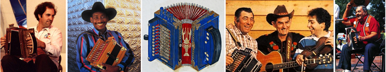
I think that the shirt should have the logo at the top of this page!  Designed and executed by my husband Mike. It would look good on either a white or yellow shirt....
It has a 10 button Cajun style accordion and states the name of the group. You could have a small logo in the "pocket" position on the front and a large logo on the back.
Yes that was fun.. great stick people ~